

For Design Phase : 2 Weeks
My Role : UX Designer, UI Designer, UX Researches, UX Tester
This project aimed to solve critical usability and engagement issues by:
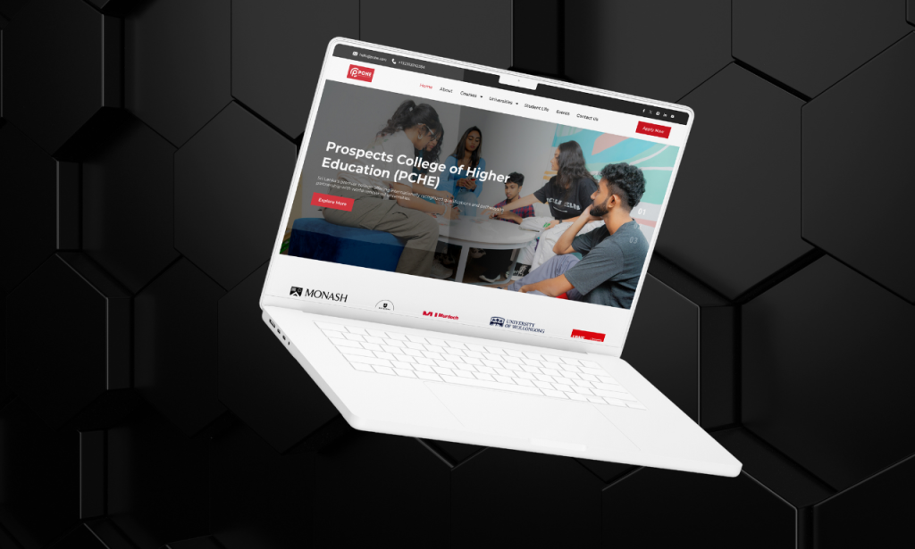
The existing PCHE website had major usability challenges:
To create a meaningful redesign, I conducted:
📌 User Research & Interviews – Spoke with students to understand their struggles with course selection.
📌 Stakeholder Discussions – Gathered insights from business and admissions teams.
📌 Comparative Analysis – Studied well-structured educational websites for best practices.
📌 Analytics Review – Identified key drop-off points and pain areas.Key Insights:
1️⃣ Students need a clear, guided approach to find courses and universities.
2️⃣ An intuitive user flow is essential to drive engagement and conversions.
3️⃣ Better navigation will reduce frustration and increase enrollment rates.
To ensure the redesign aligns with both user and business goals, I established key design principles:
The previous site had unnecessary or poorly structured pages. To prevent this, I introduced a structured content approach with three guiding questions:
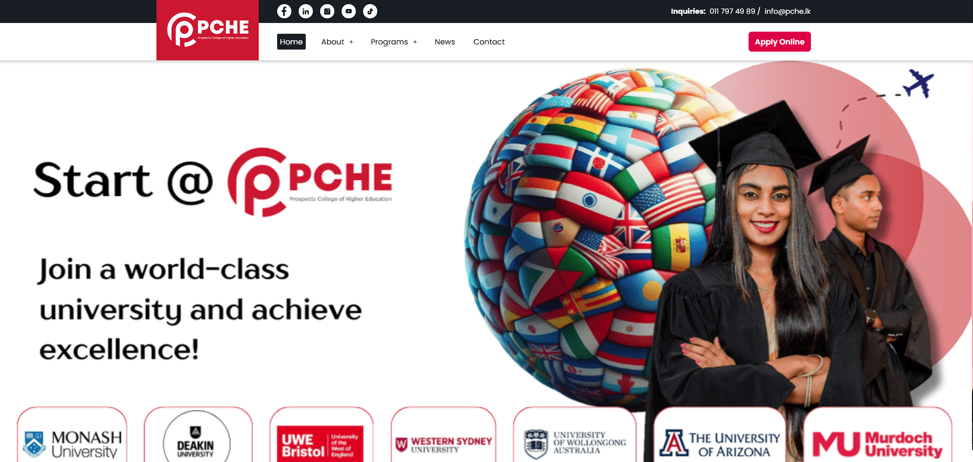
To address these issues, we implemented:
✅ Simplified Navigation & User Flow – A structured system for filtering courses and universities.
✅ Revamped Course & University Pages – Detailed course descriptions, eligibility criteria, and university highlights.
✅ Enhanced Search & Filtering – Helping students quickly find what they need.
✅ Engagement-Boosting Features – Interactive tools, FAQs, and testimonials to guide users.
We replaced outdated structures with a modern, user-friendly framework that ensures a seamless experience for both students and business administrators.


Use simple page structure and UI According to target audience. Because target audience are belong to not a tech savvy people so they need simple and basic layout structure but very user friendly and easy to use.


A UX designer’s role is to find the best balance between user needs and business goals. With multiple stakeholders involved in the PCHE website redesign, I quickly realized that a single design wouldn’t satisfy everyone. Instead of aiming for perfection for one group, I focused on crafting an informed, research-driven, and strategic solution that worked for the majority.
Additionally, usability issues on the old website were often due to limitations in the existing tools and structure. I approached these challenges by asking:
“If users are struggling, is it because the system isn’t supporting them well enough?”
Instead of just fixing symptoms, I worked on collaborative problem-solving with stakeholders, ensuring long-term usability improvements.
🔄 Leverage an Iterative Process for Risk Mitigation
While we had a clear demand for an improved website, some aspects—like course browsing behavior and enrollment flow—needed more real-world testing. I proposed launching a small set of redesigned course pages first, testing user interaction, and refining the design based on feedback. However, due to time and budget constraints, full iteration wasn’t possible.
Moving forward, I would advocate for a phased rollout, ensuring that key design decisions are validated early. Iteration is not just about refining UI—it’s a crucial strategy for minimizing risk, improving engagement, and fostering continuous growth.
By focusing on data-driven decisions, collaboration, and iterative improvements, this project reinforced my belief that great UX comes from balancing business objectives with real user needs.